Recycle Right NY
Date: Brand Campaign 2020 - 2021 / Outreach Graphics 2020 - Present
Target Audience: Residents in NYS, RRNY Stakeholders
Tools: Adobe Illustrator, Photoshop, InDesign, After Effects, Squarespace, Procreate
Role: Brand Campaign, Website Design, Illustration
Target Audience: Residents in NYS, RRNY Stakeholders
Tools: Adobe Illustrator, Photoshop, InDesign, After Effects, Squarespace, Procreate
Role: Brand Campaign, Website Design, Illustration
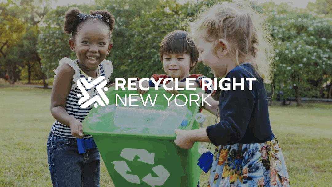
Recycle Right NY is an education and outreach effort informed by more than 100 recycling professionals from across New York State. The major goals of this campaign are to increase recycling participation and reduce recycling confusion by providing the information and resources people need to recycle right.
Working as a visual communications designer and collaborating with the outreach team at Syracuse University Center for Sustainable Community Solutions
(SU-CSCS), I was responsible for developing and executing a strong brand identity for this campaign.
View Live Website ︎︎︎
Working as a visual communications designer and collaborating with the outreach team at Syracuse University Center for Sustainable Community Solutions
(SU-CSCS), I was responsible for developing and executing a strong brand identity for this campaign.
View Live Website ︎︎︎
1. DISCOVER & RESEARCH
Understand what the campaign embodies & learn about its industry and competitors.
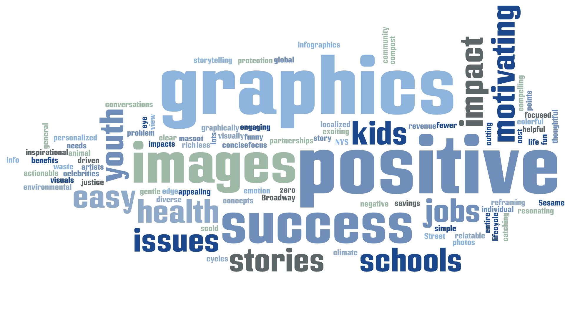
In the discovery phase, I start with understanding the brand’s goal, mission and vision by discussing with the team or client. The program coordinator sent me an image of the keywords drawn from survey responses that were administered to the Recycle Right NY stakeholder group regarding campaign tone, focus and approach.

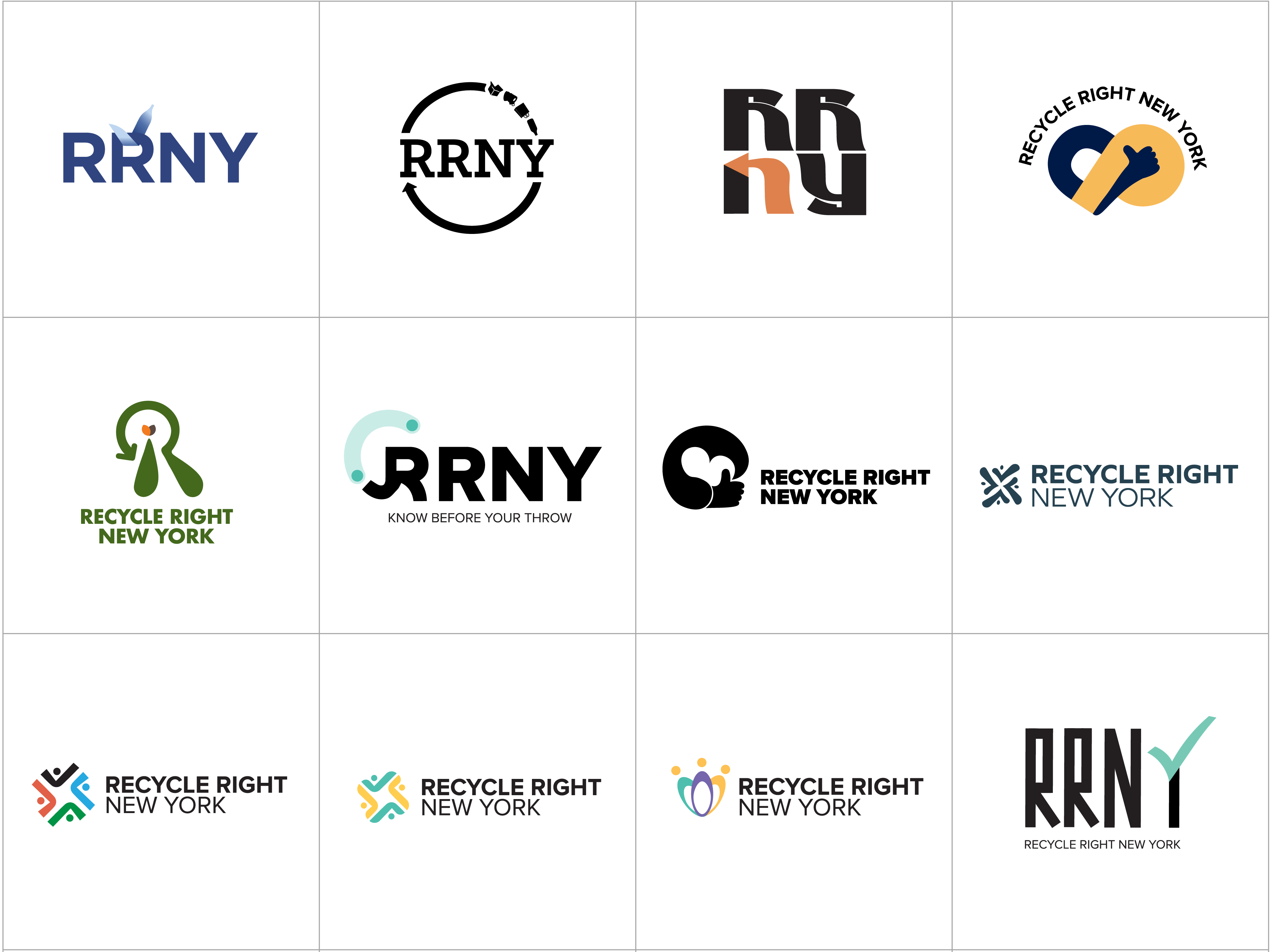
Then, I researched diverse logos of current recycling organizations to draw insights that will serve me later on in the ideation phase. In order to differentiate the RRNY campaign from other campaigns and organizations, I found three common elements in their logos: state map/shape, arrow, and recycle symbol. Also, most of them share similar color schemes such as green and blue.
2. BRAINSTORM & IDEATION
Develop ideas & decide on art direction.
Based on the discovery and research performed, I simply started brainstorming logo ideas and creating moodboards. Focusing on this campaign’s vision, mission, personality and tone of voice, I also searched for the font, color, style etc. and considered all aspects of visual language that would embody its brand strategy.
Keywords: hope / positivity / confidence / thumbs up / community / human / connection

3. SKETCH & DESIGN
Create logo concepts based on the strategy & execute them digitally.
Based on the discovery and research performed, I started sketching out many logo ideas. Once I had a ton of sketches, I selected the most promising concepts and executed them digitally.
4. PRESENT & DELIVER
Review logo ideas with the team & deliver the finalist.
After going through reviews and votes with the SU-CSCS team, SUNY-ESF and DEC (New York State Department of Environmental Conservation), the logos were narrowed down from more than ten ideas to this finalist for the RRNY campaign. Once the finalized design was approved, I delivered the brand identity package including logo artwork and a style guide.

RRNY Logo Concept
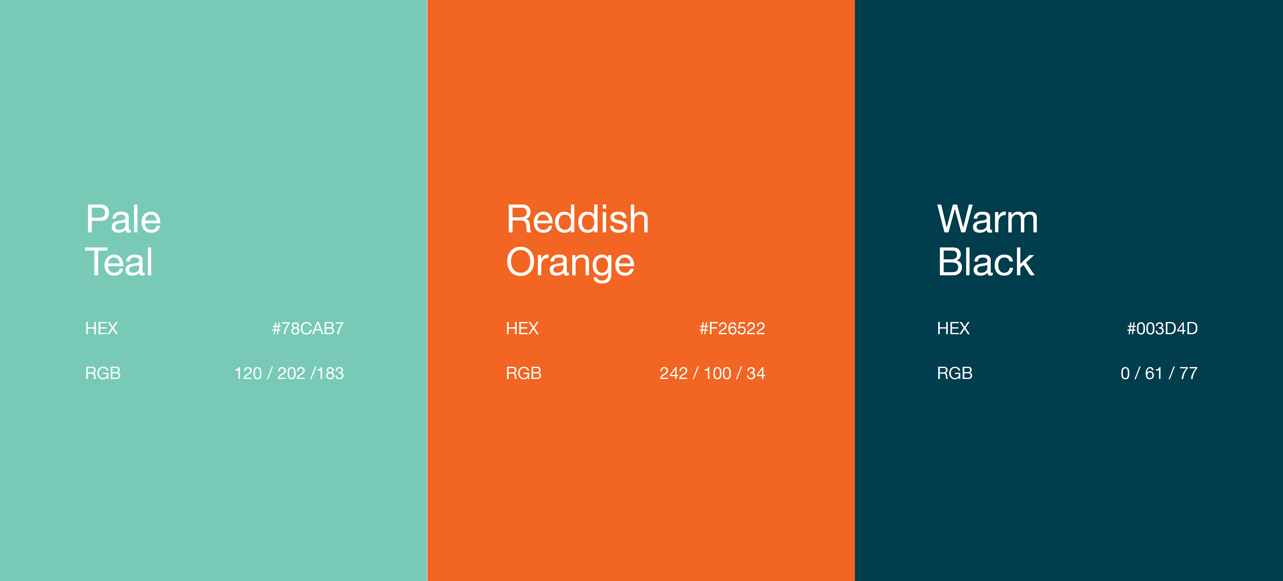
RRNY Color Schemes
The primary color schemes for this campaign are orange, teal, and dark green. Since green and blue are commonly used for logos of recycling organizations, I tried to avoid them and picked colors that contrast with each other and bring a positive mood to the campaign.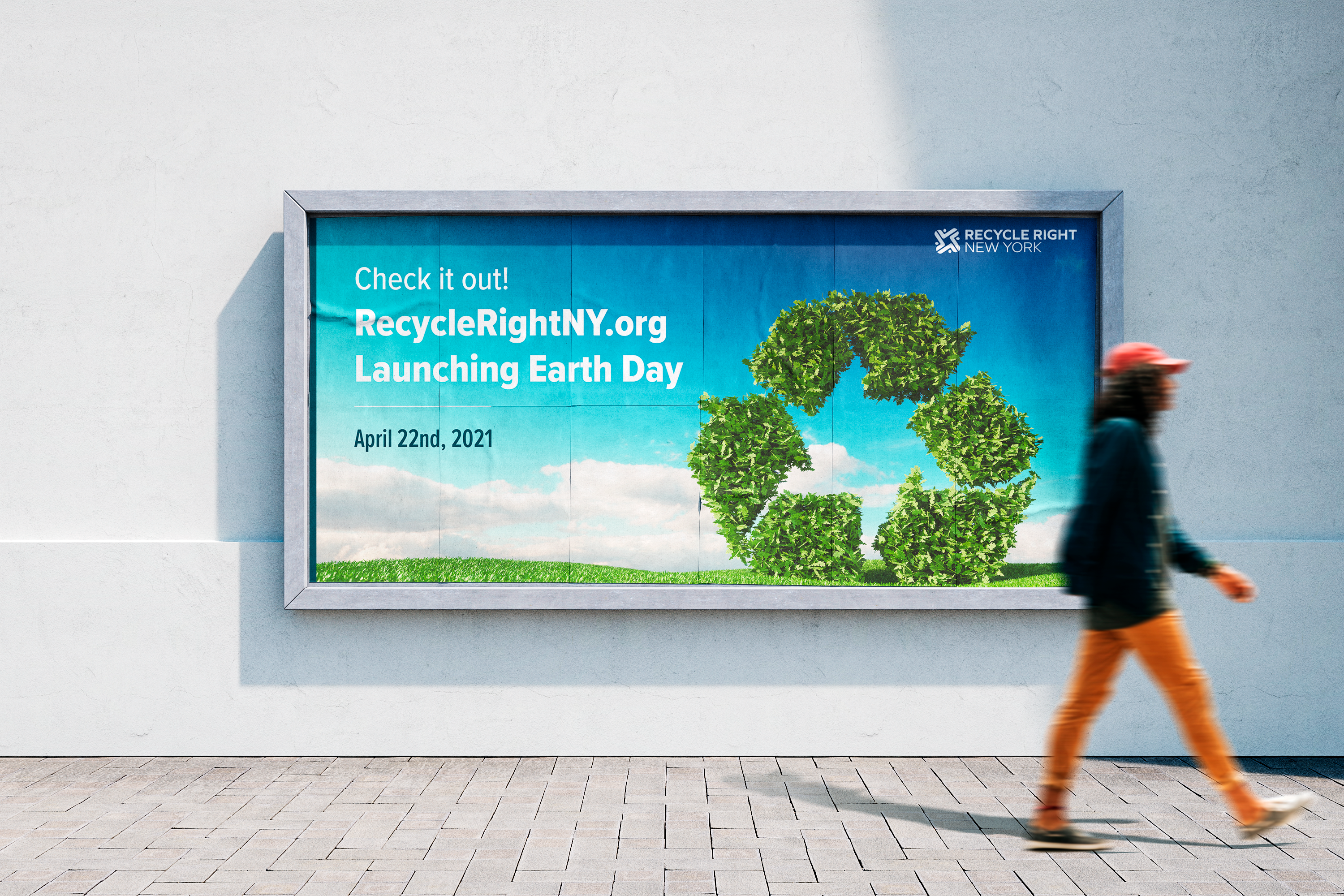


RRNY Banner / Poster / Stickers / Magnet

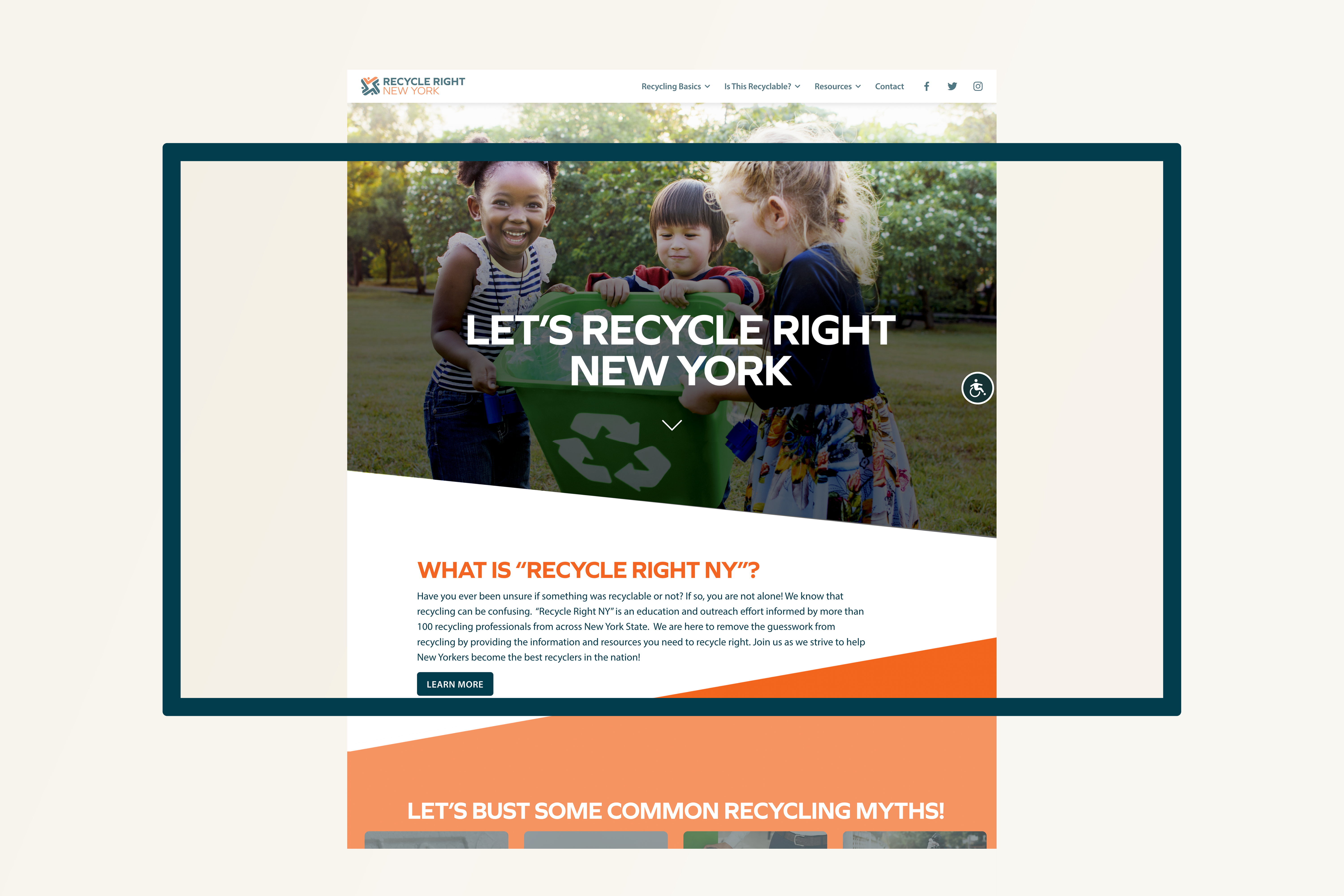
RRNY Website Design
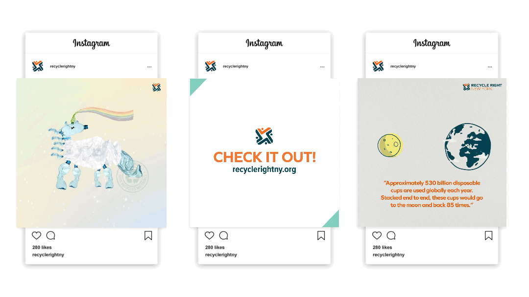
SOCIAL MEDIA
OUTREACH MATERIALS
I created monthly outreach graphics in both English and Spanish to convey messages for the RRNY campaign for its website, Facebook and Instagram account. To view more outreach content graphics, please go to @recyclerightny︎︎︎ or the outreach materials page︎︎︎ on the RRNY website.